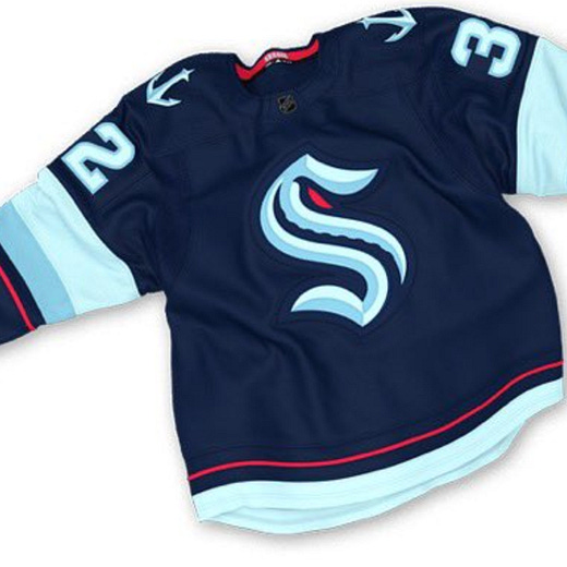
Release the... Great Branding?
The Seattle Kraken indeed
Normally, it goes something like this: a sports team releases a new name/branding/logo and everyone immediately shits all over it. This is especially true on Design Twitter, where within an hour, we get new branding mockups which are deemed far superior to the original, even though the original undoubtedly took months of work and millions of dollars spent.
But something strange happened today. That is — the opposite happened.
When the branding for the NHL’s new team in Seattle was unveiled everyone… loved it. And rightfully so! The Seattle Kraken is the right combination of a great name, a great logo, great colors, and just great branding overall. I mean, the secondary anchor logo incorporates the Space Needle for chrissakes.
This is a weird, complicated time in sports names and branding, to say the least. We now have the Washington Football Team, for example. That is the name they’re going with for the NFL team this year. Seriously. Likewise, the Cleveland Indians (incidentally, my hometown team) don’t seem long for this world — but at least there are seemingly some decent options there.
Anyway, color me impressed by the Seattle group that yes, released the Kraken. Normally, we’d have a great name like this teed up — like, say, the New Orleans Brass — and instead ownership goes with a ridiculously goofy one. Like, say the New Orleans Pelicans. The Kraken may or may not be any good for a long time, but at least they won’t be some lame bird. Next up: the SuperSonics.


